
It’s the perfect time to introduce a new Prairie Trail logo. Ten years ago, Prairie Trail was just an idea. ‘Imagine the Possibilities’ was the theme as we talked about the vision of a community with tree-lined streets, distinctive homes, restaurants and shops within walking distance, parks and trails connecting the residents to each other and to the larger Ankeny community.
Prairie Trail is real.
A lot has happened in those ten years. Prairie Trail looks and feels very much like the original planners imagined. Early development of the infrastructure and an economy moving forward again have set the stage for the next wave of progress.
Hundreds of residents now call Prairie Trail home. Families, singles and people of all ages can find a residential option to suit their needs. There is truly something for everyone. Robust residential growth will continue and when complete, approximately 8,000 residents will live in Prairie Trail.
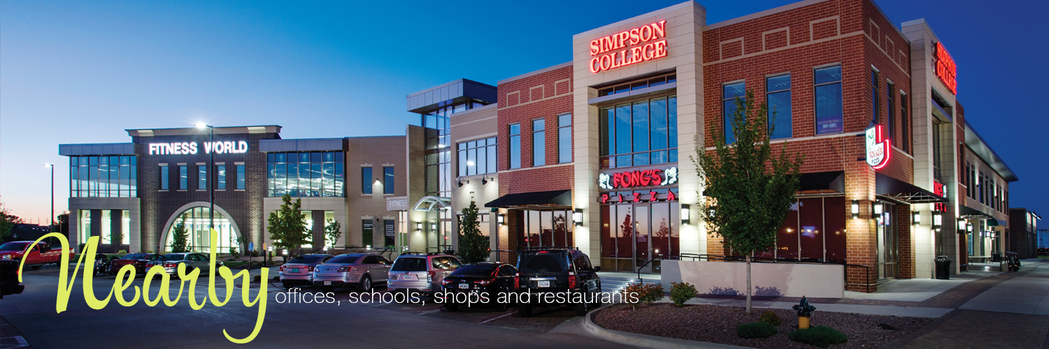
Amidst the sights and sounds of new construction, business is booming in Prairie Trail, too. Designed as the entertainment center for the development, The District is currently home to four restaurants, shopping, fitness, eduction, offices and more is on the way. The District is truly becoming a destination.
Now is the time.
It’s the perfect time to update the Prairie Trail logo and to re-introduce The District logo — both designed to capture the essence of the Prairie Trail brand today.
![]()

What’s behind the update?
For those of you interested in the art and science of brand development, here is a peek at some of the meaning behind the new logo.
People love Prairie Trail and our research shows that once they begin to wonder about moving here, they drive through the neighborhoods and devour the website. And, whether it’s the physical space or the digital space, viewers see the same thing:  beautiful homes with front porches, unique streetscapes, gently curving streets, greenspaces and waterways, schools, businesses that convey a similar architectural style and entrepreneurs’ who cater to the residents, plus regular new announcements. Growth and energy! It’s why we’ve adopted the hashtag #alwayssomethinghappening.
When designing the new logo, it was important to capture the energy of the new Prairie Trail and yet keep the brand equity already established.
Key attributes are the color green and the gently grasses bending in the breeze.
Green reminds our audience that Prairie Trail is built on the prairie with careful attention to conservation planning practices and the typography of the land.
The grasses are simple and bold lines, much better for the world of digital marketing. Bringing more attention to a few of the individual blades of grass rather than a lot of grass feels more personal, as if you’re right up in it instead of looking at Prairie Trail from a distance.
The close-up blades as well as the darker green give a sense of depth and interest because there is so much more to Prairie Trail than a traditional suburban development. Everyone is invited to explore.
We’ve transitioned the primary lines from a square to a circle. The organic circle shape is less rigid and more encompassing. The circle within a circle is symbolic of the community of Prairie Trail, now seamlessly joined to the larger community of Ankeny and Iowa.
They typeface remains the same for the new Prairie Trail logo, except for the color. The words are deliberately a muted Charcoal color. It’s more sophisticated, yet softer and more contemporary than what was before a very dark blue.
The icon is an integral part of the logo, but it does allow more freedom to use it in a horizontal format like this.

The District logo.
While there are fewer changes to the logo for The District at Prairie Trail, it feels new because we have rarely used it to date. With The District growing rapidly, you’ll begin to see this logo a lot more often.
The darker orange color is the same, but we’ve added the light green outer circle. You will see this logo used with the Prairie Trail logo frequently. It is also designed to stand alone, so the lighter green ring is meant to remind the audience that The District is central to the Prairie Trail community.
For those of you who need copies of the logo and new brand standards, please visit the website at prairietrailankeny.com/new-logos or send an email to ashley@prairietrailankeny.com.
Just for fun (or your next school project), take a look at this infographic from AdWeek.com called “The Evolution of 18 Major Brand Logos from 1886 to Today”.